HTML #1 YMCA CAMP

URL:http://www.ycampingservices.org//

YMCA of Metropolitan Detroit's Camping Services this website provides information on courses that are going to be conducted. Viewers can use the site to register for programmes and the can also read feed back from participants.

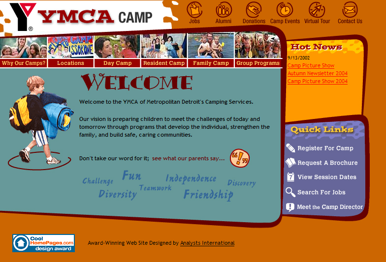
The site is easy to navigate through. The main purpose of the site is to advertise their courses, they have placed this information in the main surfing area, they also made these links more attractive by placing a photographs with the links this will draw people to view the more important information. The quick links section directs people to important sections like "register for camp" or "session dates", these links direct people straight away and makes it faster for them to get information they want.

The design of the site is quite interesting, its shapes and fun design make it attractive to both parents and children. The photos allow viewers to see the actual courses being conducted; it provides users with a real and positive view of the camp.

The site contains a lot of information, it is arranged systematically but in very large chunks. Users have to scroll down a lot to read information. Links have been provided only on top so that users can go to a particular section within that page, but users still have to scroll to the top again to select a new link. A link should be place at the end of each section.

The virtual tour makes the site more interactive an gives users a view of thr camping grounds.

Overall i think the design gives out a fun feeling , the colours used give a warm and outdoor feeling to the site and i think it represents the camp well. The designers have made this site homely, like a kind of scrap book, i think this will attract viewers to their programmes.


HYBRID #1 YBCA

URL:www.ybca.org

YERBA BUENA CENTRE FOR THE ARTS is a centre that presents visual and performing arts as well as educational programs, emphasizing the diverse artists and communities in that area.
The site is used for providing information, services, facilities and information for events for its various art forms.

The site uses flash mainly for its navigation bar. It is also an area where photographs can be displayed and changed dynamically. The flash provides some smooth movement to the page. The flash also provides some interesting visual feedback with its smooth rollovers. Seperating the main title in to sub sections makes it easier for people to access information as it guides users along.

The design is quite simple and conventional but I think the flash transition makes it interesting. Its simplicity also makes it easy to navigate through.

The flash movie also provides prompts for users notifying them where the main navigation is.

The website has to update its information very frequently so using html for is content is a better idea.

The site has many different links and categories but it is structured in a systematic way that helps separate the different links.

The layout of information is really long and the user has to scroll a lot to get to information.

Navigation is easy and links back to the previous page are usually provided so you don’t get lost within the site.

The site loads quickly and is easy for most people to access and view.

I think this site serves its purpose it provides information which is quite easy for most users to access , at the same time the design, even though simple, is also quite attractive .


FLASH #5 BURGER HUT

URL:sliceofbacon.com

Burger Hut is the portfolio of Suren Perera an illustrator and flash animator.

To navigate around the site you first have to order some thing from "the guy at the counter" and introduction to the menu will be given and u can select from the different categories. "the guy at the counter" will then hand you your "meal" and you can surf through your meal, if your still hungry just place another order at the counter. I think this site shows of the designer's skills at flash animation and illustration. His illustrations show of his own morbid but humorous sense of style and the animation shows of his flash animation skills.

Surfing throughout this site is surfing through a fast food joint that has very good customer service, it is interactive, the characters move about and respond to your click. "The guy at the counter" shows your what you can select, once your inside the categories the designer has provided interesting prompts like "more stuff" and "place another order" help you surf around the category or get out of it.

On the main page funny characters walk around ordering food, they are direct links to some of his works they help make the page more interactive as you have to hurry to click them before they move away its because of this that the page is quite fun to play around with.

This page does show off the designer's skills and style, which is important since this is his portfolio, the page is also really quirky and new which attracts people.