FLASH #4 SELFRIDGES & CO.

URL:selfridges.com

Selfridges & Co. is a chain of departmental stores in the UK. This flash site serves as a guide to all its stores in the UK.

The sites main colour is blue which is a colour that appeals to its wide range of users pages are colour.

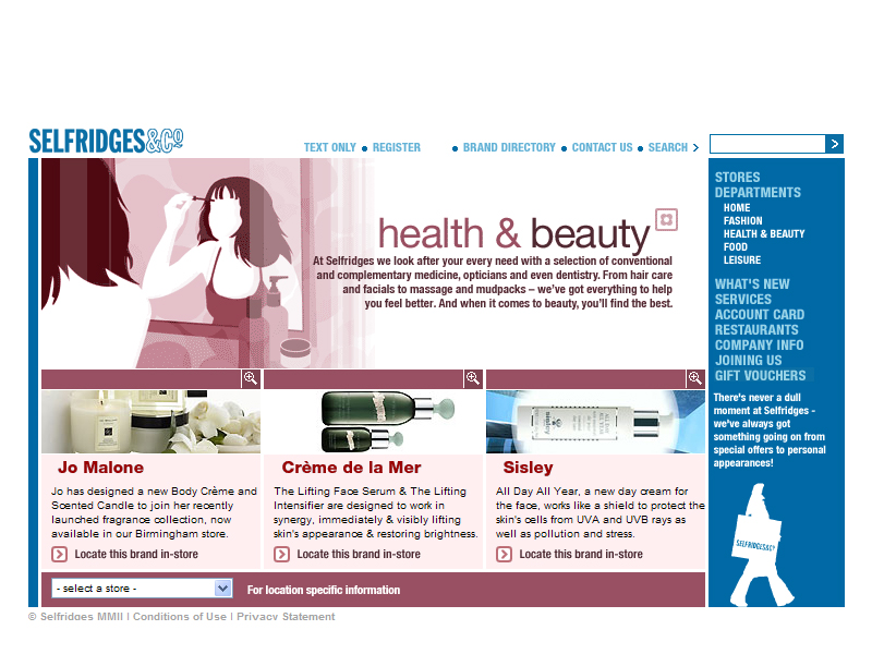
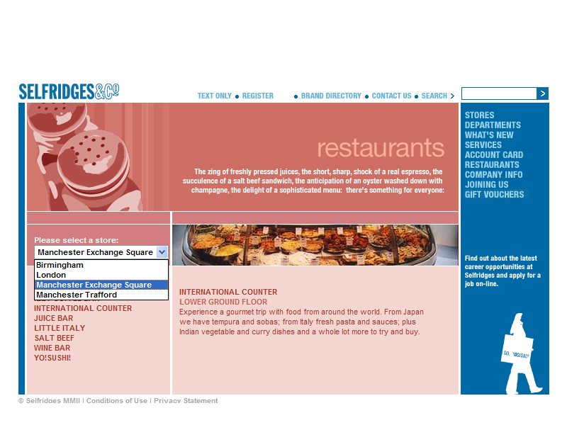
The design and layout looks simple and very conventional but because of this users are able to access information more easily. This layout is consistent through out the site and makes it systematic for users to view, the users will always know where to find the information, the links or the navigation bar. As this site is like a guide it should allow people to find information in the shortest possible time and a consistent and familiar layout helps to do that.

The site contains a lot of information but the layout of information is well structured and finding specific sections is easy.

The page does not contain much dynamic flash animation but it uses flash very practically to provide simple rollovers that provide extra information or visual feedback. The rollovers provide short summaries of the content within the link. This allows people to be more aware of where they are going.

Navigating through the site is easy as under the different headings in the navigation there are sub headings which take you directly to the place you want.

The site loads quickly but they also provide a text version of the site.

Overall I think this site serves its purpose it's easy for users to get information. I think for a site like this content is very important, I feel this site provides relevant information that is structured in an interesting way.


FLASH #3 SHIMANO XTR

URL:xtr.shimano.com

SHIMANO XTR is a company thay designs mountain bike cross-country racing components, its cilents are peoplewho are into extreem sports and the outdoors. The site is a catalogue of some of the companies products.

The level of interaction is quite high with dynamic rollovers and interesting transitions.Navigation is quite simple and theres breadcrumb navigation so you know where you are.The design is slick cool but the colours make it a little difficult to read especially when its the dark grey against the darker grey this also makes it harder to navigate aaround. The fonts are also really small. The site contains alot of information, it is placed systamatically but the place seems crammed.The surfable area has been decorated with many lines that break up the page and make it seem more crammed. Certain text and areas of the page are highlighted in bright blue, ot draws the eye to the head lines and alerts but the contrast is very great and these blue patches distract the viewer.


The website provides a good amount of information, their clients can view many aspects of a single product and get a more complete picture of the products through detailed descriptions,diagrams and animations, this information is arranged quite systamatically and it is easy for users to acess.The colours used are fitting the grey and black project a powerful and "cool" feel. The blue hightlights show vibrancy.The sound feed back is quite annoying and there is no way to turn it of.

This website does appeal to its clientel as it looks really slick and cool. It is a good catalogue for people who are interested in buying a bike.


FLASH #2 INTENTIONALLIES

URL:intentionallies.com

Intentionallies is a Japanese architectural firm. This is a flash site. The page has made the surfing area like a desktop with cards strewn across. By clicking on the cards you can expand them and get the details. You can also pick cards up and arrange them on your "desktop". The new arrangement will be saved so the next time you enter the site your customised layout will still be there.

I think this site is very interactive, it gives users the chance to arrange their information to suit their needs users are now users have freedom to choose what information they want to display. The cards can be arranged in any order you like but there is a drop down menu where you can choose how you want to arrange the cards, The menu follows your cursor around so that you don't have to go and find it. This is a really good idea as the drop down menu is very handy when you want to select and arrange certain categories or orders.

The site is very visually based, you zoom in and out and change your views from left to right, people
can orientate themselves to where they are and how to proceed. The navigation is quite simple, users are guided through the site. Using the desktop concept allows the company to place their contact information and other essential information on the first page. This is a good idea as it helps people get their information easily without the hassle of navigating through many pages.

One problem of this site is that you have to go through the same process for view every card and that can take up a bit of time. The site takes some time to load.

Overall I think this site is very good due
to its different concept.


FLASH #1 OCTOPUS DESIGNS

URL:www.giantoctopus.com

GIANT OCTOPUS is a design compay that specialises in design for broadcast media, it also provides other mediums of graphic design and marketing.Its clientel consist
mainly of News stations and TV networks.
The website is made to feel as if the user is interacting in an underwater atmosphere, thats quite fitting for a company who's name is octopus.

The Layout is clean and simple, only five buttons at the start, it is fast to locate The site uses a directory tree for users to navigate through. It is very systematic and clear for users to find information and and view the company's porfolios as users can see the links and the flow of the
information on the site.

The Portfolio's Visual OverView gives people an idea of which project they would like to see with out having to go through the whole menu. This feature is good as it makes it more convenient for potential clients and guest to view.

The directory tree always centralises itself thats very useful as the information is easily viewed..

The menu responds as if it is submerged in water. And clicking arouund the menu disturbss the under water atmosphere and produces a "wave" . The fluid movement from section to subsection also adds to the atmosphere and theme.

The site loads quickly within a few seconds.

Overally i think this site is very well designed. Its basic concept and design is unique and striking.
It is easy to navigate through. The information is placed in a strctured and interesting manner. the interactions are interesting and dynamic but does not distract from the information. the monotic colour scheme balances out the movement within the site.