Late at night

I tell u, this designer shit is tiring, u really gotta have the passion for it.

I think passion is more important than anything, cause , seriously, you can learn to do anything, as in anything, even things which people say cant be learnt, like drawing and stuff. I seriously think any one can learn to do it, you wont be the best, but u'll definitely not be the worse.

BUT, if you don't have the passion to actually do it, you can't. You might have the talent, you can just draw, I can just draw, my drawings turn out better than the average person, but its just the average person, I think I could be good, but I don't always feel like drawing. So no passion there. But some times yah.

If u watched Centerstage you'll understand this better. There was this dancer, she was perfect, she had perfect every thing, body, technique, everything was right, but she didn't have the heart, ( this is not corny shit , its true). Dancing was physically easy for her, but somewhere inside her it was torture. She forced herself to do it. And eventually she couldn't take it.

On the other hand , there's this other girl, bad feet wrong, body, dancing physically difficult for her, near impossible that she'll ever be a technically strong dancer. But she did it anyway, because she wanted to, and she could cause the "want" always kept her going.

This design shit is so like that. Most things in life are like that. So yah ("_). This can make you really happy or sad. So I guess passion can develop, who knows one day I might like this writing shit, or feel lost with out being able to design. You never know.

Hello.....

I dont get these blog things.
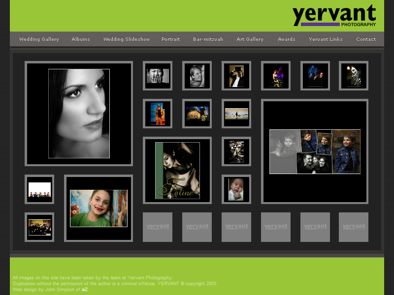
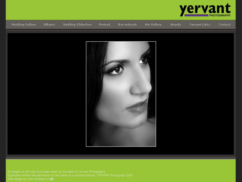
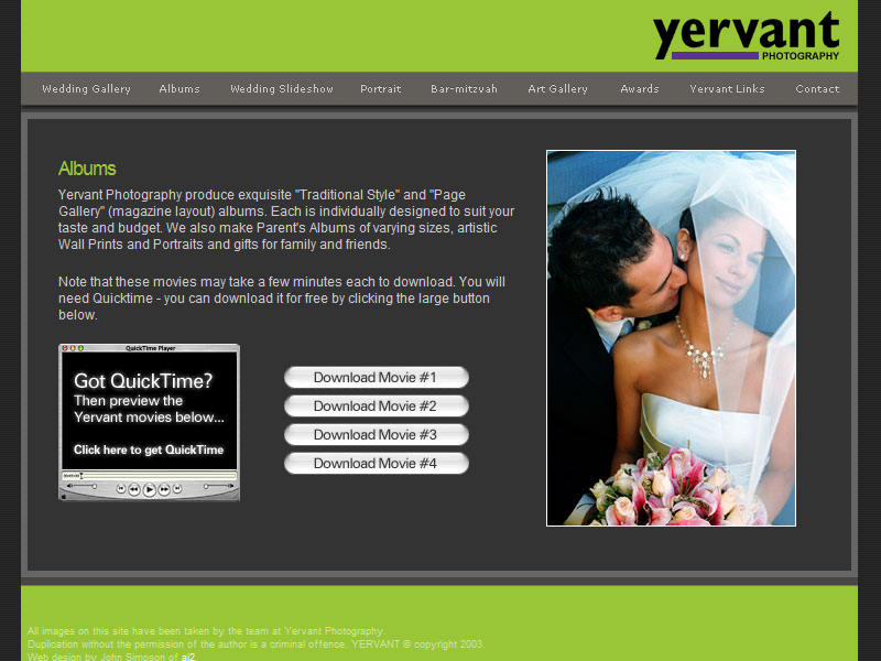
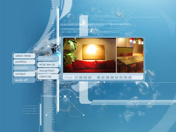
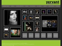
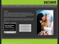
HYBRID #4 AMNESTY INTERNATIONAL

URL: www.amnesty.org


This is the website for Amnesty International. The site provides information to the users on Amnesty International and information on situations that it’s covering.

The site is mainly in html, the main page looks quite cluttered because they have tried to fit a lot of information on it, but all the information place are important updates on situations and campaigns.

They know users will have to scroll down to view the information, so they have placed another set of links at the bottom to make it easier for users.

The navigation is a little messy and you often find yourself lost and un able to find what you are looking for, for example I was look in for the “Stop Violence Against Women” campaign when I clicked on the link to the “Stop Violence Against Women” campaign I found myself in a sub link that had many other sub links. Breadcrumb navigation was provided but its only 2 levels the main link and then the sub link. I don think this is enough as there are many other links within the links themselves.

The site uses flash to present some of its campaigns. This is good as it makes the site more interactive and can make people more interested in being active for causes. Html versions are provided also which is useful for people who don’t have flash, of have slower connections.This website has to be able to reach as many people as possible to spread awareness on various serious issues, so by making a hybrid site it makes it easier for most people to access. The flash components make the presentations and campaigns more interactive and dramatic; it appeals audio visually to users


HYBRID #3 OTTER DECOYS

URL: www.otterdecoysales.com

“Otter Decoys” is a company manufactures decoys for hunters.
The site is a catalogue for the products, they have made html tables to arrange the goods, photos of the products can be seen when you click on the links. This is a neat and simple way to organise information but it is very plain and ordinary.
What makes the page interesting is the flash navigation bar that it a cross hair aiming at the links; users select the links by shooting at them. This really creates and connects to the products that they are selling. Since its main clientele are hunters this is some thing that I think they will find extremely fun and enjoyable to use.

The rest of the site uses html. It is quite ordinary but it provides essential information of their products (pricing and detailed images) and contact information. Users will find it easy and fast to get the information that they need.

There is an irritating fault in the design, an arrow that looks like a button was placed next to the links so users would think that is the button to the link but its not.

The overall colour scheme is a brownish colour; this suits the theme of the website and the products that they are selling.

In this site the flash made the page more interesting, but I feel that the designer could have tried to use more flash to make the presentation of the products more interesting. Overall the site is quite simple.


HYBRID #2 YERVANT PHOTOGRAPHY

URL :www.yervant.com/portrait.htm

This site is the portfolio of the Yervant photography studio.

This site has used flash to display the main information. Small thumbnails are shown and when they are pressed a bigger picture is displayed on a black back ground. Once you release the mouse you will return to the screen with the thumbnails. This is a little bit irritating but it might be a way to prevent people from copying and using their pictures. It also helps people to focus on the picture that they are "holding on" to.

I think it was a good decision to use flash, the many thumbnails take a while to load but because flash streams the images we are able to view those that are already loaded instead of having to wait for all of them to load.

The navigation is simple but the categorizing of the different sections is a little bit messy, the links to the galleries are separated and things like the album and slide shows that are both videos should be placed together.

Apart from the user having to click and hold the thumbnails, this site is not very interactive. I think that the designer intended for the users to concentrate on the photographs and that’s alright because this site is mainly a show case of the photographers work.

I think the use of flash in this website is quite appropriate. The flash interation is easy to use and enhances the users visit to the site by giving the user a task of “holding” on to view the pictures.
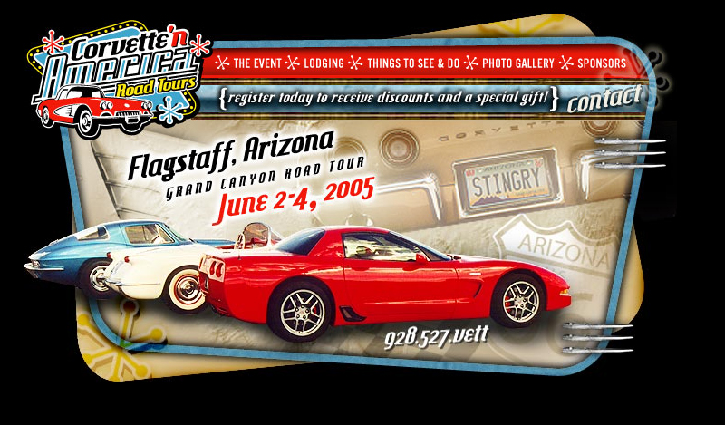
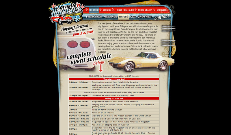
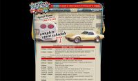


HTML #3 CORVETTE'N AMERICA ROAD TOURS

URL:www.corvetteingamerica.com

This website promotes the event "Corvette'N America Road Tours" which is a road trip for owners of corvettes. It provides information on the event, the routes that are to be taken, lodging and registration procedures.

This site has got a classic retro kind of style I think and layouts and the designs of the pages are very attractive and stylish, the all fit the style. A lot of photographs and images have been used to capture user’s attention and interest.

The site is easy to navigate through, with the standard navigation bar, links are easy to find, below the main navigation bar is a grey bar that is used to navigate with in the categories or to display highlights within that category, this is useful as the have arranged the information in to shorter chunks to make it easier for users.

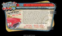
For the photo gallery a new smaller window was created to view the pictures, I think this is good as it allows people fo focus on the pictures, it is also faster for the pictures to load.

There are rollovers for visual feedback, but other than that the site is not very interactive. The pages are all made out of graphics and it takes quite a lot of time to load.

Overall I think this site has an attractive design, but it takes a bit too long to load.
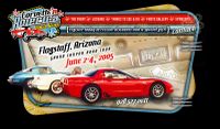
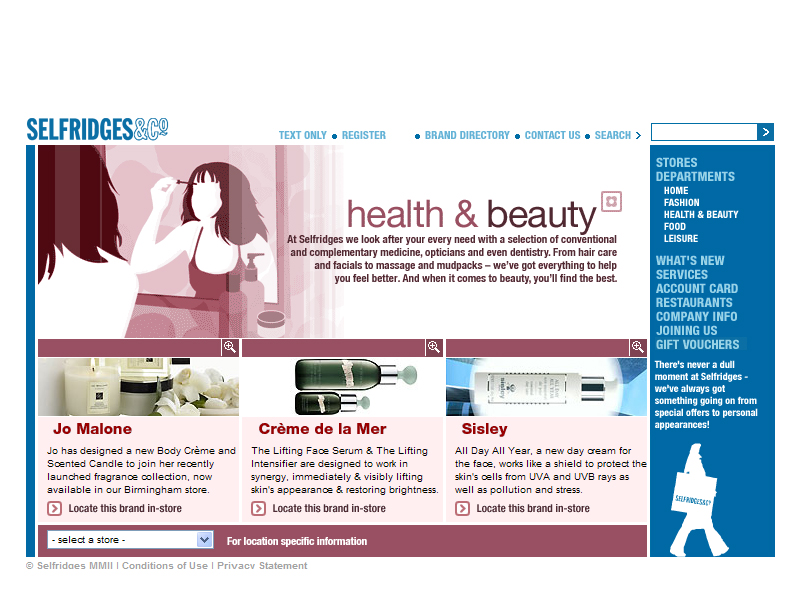
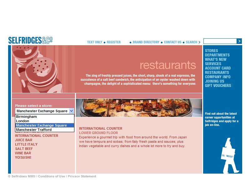
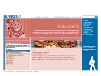


HTML#2 CLAY PLANET

URL:http://www.clayplanetdesigns.com/index.html

Clay Planet Designs this website provides promotes and sells clay figurines mainly of fish. A few features are gallaries of the artists works, check prices of items, find out information on ordering and purchasing the products .
The main purpose of the site is to advertise their products, the index page is quite attractive with an interesting tag line and an animated display of their products, a simple bubble animation was used to enhance the “fishy” feel of the website.

The layout of the page is pretty traditional but the main page looks interesting because of the colours used, the bright neon colours attract the attention of both adults and children. The text used also creates a fun and casual feeling that suits the products

The shopping page has provided catagories for different the price ranges of their products, the have created a kind of radio button indication to show which catagorie the user is at it also in cludes a rollover. This provides good visual feed back for the user.

The site looks interesting and unique because of details like the rollovers and the interesting fonts the way pictures are laid out. The designer also tried to keep the lay out fairly constant which keeps people on track.

The many coloured fonts makes it difficult to tell which ones are links and which ones are words. The text has not been laid out properly, there are some sections where the text overshoots the borders and gives the page a sloppy look.


HTML #1 YMCA CAMP

URL:http://www.ycampingservices.org//

YMCA of Metropolitan Detroit's Camping Services this website provides information on courses that are going to be conducted. Viewers can use the site to register for programmes and the can also read feed back from participants.

The site is easy to navigate through. The main purpose of the site is to advertise their courses, they have placed this information in the main surfing area, they also made these links more attractive by placing a photographs with the links this will draw people to view the more important information. The quick links section directs people to important sections like "register for camp" or "session dates", these links direct people straight away and makes it faster for them to get information they want.

The design of the site is quite interesting, its shapes and fun design make it attractive to both parents and children. The photos allow viewers to see the actual courses being conducted; it provides users with a real and positive view of the camp.

The site contains a lot of information, it is arranged systematically but in very large chunks. Users have to scroll down a lot to read information. Links have been provided only on top so that users can go to a particular section within that page, but users still have to scroll to the top again to select a new link. A link should be place at the end of each section.

The virtual tour makes the site more interactive an gives users a view of thr camping grounds.

Overall i think the design gives out a fun feeling , the colours used give a warm and outdoor feeling to the site and i think it represents the camp well. The designers have made this site homely, like a kind of scrap book, i think this will attract viewers to their programmes.


HYBRID #1 YBCA

URL:www.ybca.org

YERBA BUENA CENTRE FOR THE ARTS is a centre that presents visual and performing arts as well as educational programs, emphasizing the diverse artists and communities in that area.
The site is used for providing information, services, facilities and information for events for its various art forms.

The site uses flash mainly for its navigation bar. It is also an area where photographs can be displayed and changed dynamically. The flash provides some smooth movement to the page. The flash also provides some interesting visual feedback with its smooth rollovers. Seperating the main title in to sub sections makes it easier for people to access information as it guides users along.

The design is quite simple and conventional but I think the flash transition makes it interesting. Its simplicity also makes it easy to navigate through.

The flash movie also provides prompts for users notifying them where the main navigation is.

The website has to update its information very frequently so using html for is content is a better idea.

The site has many different links and categories but it is structured in a systematic way that helps separate the different links.

The layout of information is really long and the user has to scroll a lot to get to information.

Navigation is easy and links back to the previous page are usually provided so you don’t get lost within the site.

The site loads quickly and is easy for most people to access and view.

I think this site serves its purpose it provides information which is quite easy for most users to access , at the same time the design, even though simple, is also quite attractive .


FLASH #5 BURGER HUT

URL:sliceofbacon.com

Burger Hut is the portfolio of Suren Perera an illustrator and flash animator.

To navigate around the site you first have to order some thing from "the guy at the counter" and introduction to the menu will be given and u can select from the different categories. "the guy at the counter" will then hand you your "meal" and you can surf through your meal, if your still hungry just place another order at the counter. I think this site shows of the designer's skills at flash animation and illustration. His illustrations show of his own morbid but humorous sense of style and the animation shows of his flash animation skills.

Surfing throughout this site is surfing through a fast food joint that has very good customer service, it is interactive, the characters move about and respond to your click. "The guy at the counter" shows your what you can select, once your inside the categories the designer has provided interesting prompts like "more stuff" and "place another order" help you surf around the category or get out of it.

On the main page funny characters walk around ordering food, they are direct links to some of his works they help make the page more interactive as you have to hurry to click them before they move away its because of this that the page is quite fun to play around with.

This page does show off the designer's skills and style, which is important since this is his portfolio, the page is also really quirky and new which attracts people.


FLASH #4 SELFRIDGES & CO.

URL:selfridges.com

Selfridges & Co. is a chain of departmental stores in the UK. This flash site serves as a guide to all its stores in the UK.

The sites main colour is blue which is a colour that appeals to its wide range of users pages are colour.

The design and layout looks simple and very conventional but because of this users are able to access information more easily. This layout is consistent through out the site and makes it systematic for users to view, the users will always know where to find the information, the links or the navigation bar. As this site is like a guide it should allow people to find information in the shortest possible time and a consistent and familiar layout helps to do that.

The site contains a lot of information but the layout of information is well structured and finding specific sections is easy.

The page does not contain much dynamic flash animation but it uses flash very practically to provide simple rollovers that provide extra information or visual feedback. The rollovers provide short summaries of the content within the link. This allows people to be more aware of where they are going.

Navigating through the site is easy as under the different headings in the navigation there are sub headings which take you directly to the place you want.

The site loads quickly but they also provide a text version of the site.

Overall I think this site serves its purpose it's easy for users to get information. I think for a site like this content is very important, I feel this site provides relevant information that is structured in an interesting way.


FLASH #3 SHIMANO XTR

URL:xtr.shimano.com

SHIMANO XTR is a company thay designs mountain bike cross-country racing components, its cilents are peoplewho are into extreem sports and the outdoors. The site is a catalogue of some of the companies products.

The level of interaction is quite high with dynamic rollovers and interesting transitions.Navigation is quite simple and theres breadcrumb navigation so you know where you are.The design is slick cool but the colours make it a little difficult to read especially when its the dark grey against the darker grey this also makes it harder to navigate aaround. The fonts are also really small. The site contains alot of information, it is placed systamatically but the place seems crammed.The surfable area has been decorated with many lines that break up the page and make it seem more crammed. Certain text and areas of the page are highlighted in bright blue, ot draws the eye to the head lines and alerts but the contrast is very great and these blue patches distract the viewer.


The website provides a good amount of information, their clients can view many aspects of a single product and get a more complete picture of the products through detailed descriptions,diagrams and animations, this information is arranged quite systamatically and it is easy for users to acess.The colours used are fitting the grey and black project a powerful and "cool" feel. The blue hightlights show vibrancy.The sound feed back is quite annoying and there is no way to turn it of.

This website does appeal to its clientel as it looks really slick and cool. It is a good catalogue for people who are interested in buying a bike.


FLASH #2 INTENTIONALLIES

URL:intentionallies.com

Intentionallies is a Japanese architectural firm. This is a flash site. The page has made the surfing area like a desktop with cards strewn across. By clicking on the cards you can expand them and get the details. You can also pick cards up and arrange them on your "desktop". The new arrangement will be saved so the next time you enter the site your customised layout will still be there.

I think this site is very interactive, it gives users the chance to arrange their information to suit their needs users are now users have freedom to choose what information they want to display. The cards can be arranged in any order you like but there is a drop down menu where you can choose how you want to arrange the cards, The menu follows your cursor around so that you don't have to go and find it. This is a really good idea as the drop down menu is very handy when you want to select and arrange certain categories or orders.

The site is very visually based, you zoom in and out and change your views from left to right, people
can orientate themselves to where they are and how to proceed. The navigation is quite simple, users are guided through the site. Using the desktop concept allows the company to place their contact information and other essential information on the first page. This is a good idea as it helps people get their information easily without the hassle of navigating through many pages.

One problem of this site is that you have to go through the same process for view every card and that can take up a bit of time. The site takes some time to load.

Overall I think this site is very good due
to its different concept.


FLASH #1 OCTOPUS DESIGNS

URL:www.giantoctopus.com

GIANT OCTOPUS is a design compay that specialises in design for broadcast media, it also provides other mediums of graphic design and marketing.Its clientel consist
mainly of News stations and TV networks.
The website is made to feel as if the user is interacting in an underwater atmosphere, thats quite fitting for a company who's name is octopus.

The Layout is clean and simple, only five buttons at the start, it is fast to locate The site uses a directory tree for users to navigate through. It is very systematic and clear for users to find information and and view the company's porfolios as users can see the links and the flow of the
information on the site.

The Portfolio's Visual OverView gives people an idea of which project they would like to see with out having to go through the whole menu. This feature is good as it makes it more convenient for potential clients and guest to view.

The directory tree always centralises itself thats very useful as the information is easily viewed..

The menu responds as if it is submerged in water. And clicking arouund the menu disturbss the under water atmosphere and produces a "wave" . The fluid movement from section to subsection also adds to the atmosphere and theme.

The site loads quickly within a few seconds.

Overally i think this site is very well designed. Its basic concept and design is unique and striking.
It is easy to navigate through. The information is placed in a strctured and interesting manner. the interactions are interesting and dynamic but does not distract from the information. the monotic colour scheme balances out the movement within the site.