HYBRID #4 AMNESTY INTERNATIONAL

URL: www.amnesty.org


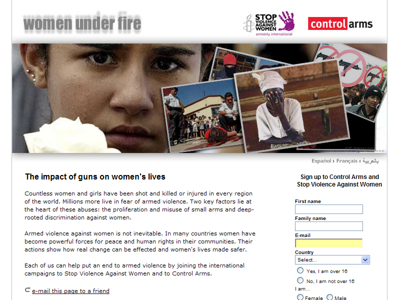
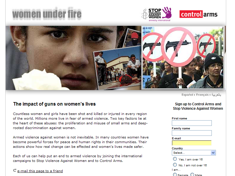
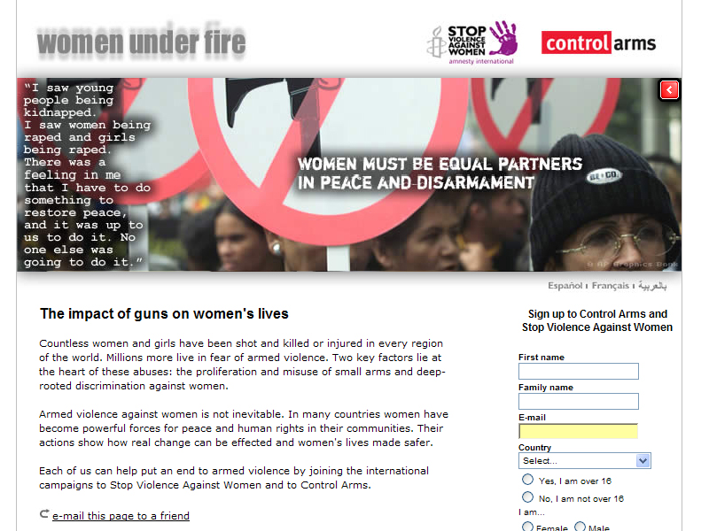
This is the website for Amnesty International. The site provides information to the users on Amnesty International and information on situations that it’s covering.

The site is mainly in html, the main page looks quite cluttered because they have tried to fit a lot of information on it, but all the information place are important updates on situations and campaigns.

They know users will have to scroll down to view the information, so they have placed another set of links at the bottom to make it easier for users.

The navigation is a little messy and you often find yourself lost and un able to find what you are looking for, for example I was look in for the “Stop Violence Against Women” campaign when I clicked on the link to the “Stop Violence Against Women” campaign I found myself in a sub link that had many other sub links. Breadcrumb navigation was provided but its only 2 levels the main link and then the sub link. I don think this is enough as there are many other links within the links themselves.

The site uses flash to present some of its campaigns. This is good as it makes the site more interactive and can make people more interested in being active for causes. Html versions are provided also which is useful for people who don’t have flash, of have slower connections.This website has to be able to reach as many people as possible to spread awareness on various serious issues, so by making a hybrid site it makes it easier for most people to access. The flash components make the presentations and campaigns more interactive and dramatic; it appeals audio visually to users


HYBRID #3 OTTER DECOYS

URL: www.otterdecoysales.com

“Otter Decoys” is a company manufactures decoys for hunters.
The site is a catalogue for the products, they have made html tables to arrange the goods, photos of the products can be seen when you click on the links. This is a neat and simple way to organise information but it is very plain and ordinary.
What makes the page interesting is the flash navigation bar that it a cross hair aiming at the links; users select the links by shooting at them. This really creates and connects to the products that they are selling. Since its main clientele are hunters this is some thing that I think they will find extremely fun and enjoyable to use.

The rest of the site uses html. It is quite ordinary but it provides essential information of their products (pricing and detailed images) and contact information. Users will find it easy and fast to get the information that they need.

There is an irritating fault in the design, an arrow that looks like a button was placed next to the links so users would think that is the button to the link but its not.

The overall colour scheme is a brownish colour; this suits the theme of the website and the products that they are selling.

In this site the flash made the page more interesting, but I feel that the designer could have tried to use more flash to make the presentation of the products more interesting. Overall the site is quite simple.


HYBRID #2 YERVANT PHOTOGRAPHY

URL :www.yervant.com/portrait.htm

This site is the portfolio of the Yervant photography studio.

This site has used flash to display the main information. Small thumbnails are shown and when they are pressed a bigger picture is displayed on a black back ground. Once you release the mouse you will return to the screen with the thumbnails. This is a little bit irritating but it might be a way to prevent people from copying and using their pictures. It also helps people to focus on the picture that they are "holding on" to.

I think it was a good decision to use flash, the many thumbnails take a while to load but because flash streams the images we are able to view those that are already loaded instead of having to wait for all of them to load.

The navigation is simple but the categorizing of the different sections is a little bit messy, the links to the galleries are separated and things like the album and slide shows that are both videos should be placed together.

Apart from the user having to click and hold the thumbnails, this site is not very interactive. I think that the designer intended for the users to concentrate on the photographs and that’s alright because this site is mainly a show case of the photographers work.

I think the use of flash in this website is quite appropriate. The flash interation is easy to use and enhances the users visit to the site by giving the user a task of “holding” on to view the pictures.


HTML #3 CORVETTE'N AMERICA ROAD TOURS

URL:www.corvetteingamerica.com

This website promotes the event "Corvette'N America Road Tours" which is a road trip for owners of corvettes. It provides information on the event, the routes that are to be taken, lodging and registration procedures.

This site has got a classic retro kind of style I think and layouts and the designs of the pages are very attractive and stylish, the all fit the style. A lot of photographs and images have been used to capture user’s attention and interest.

The site is easy to navigate through, with the standard navigation bar, links are easy to find, below the main navigation bar is a grey bar that is used to navigate with in the categories or to display highlights within that category, this is useful as the have arranged the information in to shorter chunks to make it easier for users.

For the photo gallery a new smaller window was created to view the pictures, I think this is good as it allows people fo focus on the pictures, it is also faster for the pictures to load.

There are rollovers for visual feedback, but other than that the site is not very interactive. The pages are all made out of graphics and it takes quite a lot of time to load.

Overall I think this site has an attractive design, but it takes a bit too long to load.


HTML#2 CLAY PLANET

URL:http://www.clayplanetdesigns.com/index.html

Clay Planet Designs this website provides promotes and sells clay figurines mainly of fish. A few features are gallaries of the artists works, check prices of items, find out information on ordering and purchasing the products .
The main purpose of the site is to advertise their products, the index page is quite attractive with an interesting tag line and an animated display of their products, a simple bubble animation was used to enhance the “fishy” feel of the website.

The layout of the page is pretty traditional but the main page looks interesting because of the colours used, the bright neon colours attract the attention of both adults and children. The text used also creates a fun and casual feeling that suits the products

The shopping page has provided catagories for different the price ranges of their products, the have created a kind of radio button indication to show which catagorie the user is at it also in cludes a rollover. This provides good visual feed back for the user.

The site looks interesting and unique because of details like the rollovers and the interesting fonts the way pictures are laid out. The designer also tried to keep the lay out fairly constant which keeps people on track.

The many coloured fonts makes it difficult to tell which ones are links and which ones are words. The text has not been laid out properly, there are some sections where the text overshoots the borders and gives the page a sloppy look.