This site is the portfolio of the Yervant photography studio.
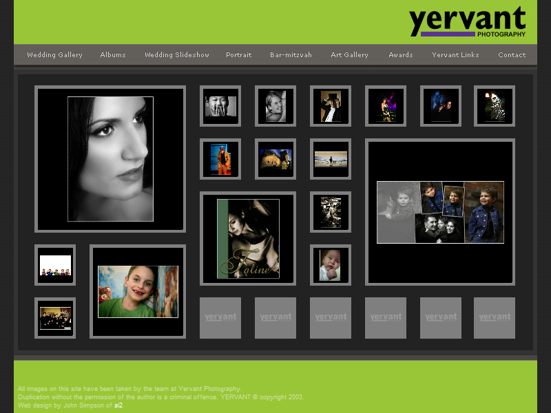
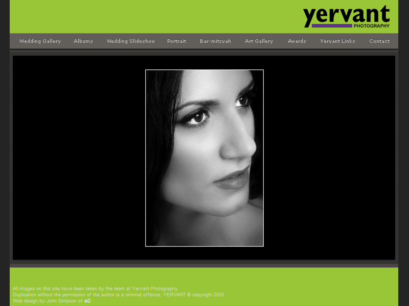
This site has used flash to display the main information. Small thumbnails are shown and when they are pressed a bigger picture is displayed on a black back ground. Once you release the mouse you will return to the screen with the thumbnails. This is a little bit irritating but it might be a way to prevent people from copying and using their pictures. It also helps people to focus on the picture that they are "holding on" to.
I think it was a good decision to use flash, the many thumbnails take a while to load but because flash streams the images we are able to view those that are already loaded instead of having to wait for all of them to load.
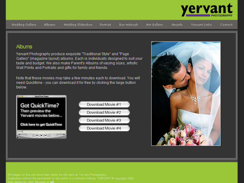
The navigation is simple but the categorizing of the different sections is a little bit messy, the links to the galleries are separated and things like the album and slide shows that are both videos should be placed together.
Apart from the user having to click and hold the thumbnails, this site is not very interactive. I think that the designer intended for the users to concentrate on the photographs and that’s alright because this site is mainly a show case of the photographers work.
I think the use of flash in this website is quite appropriate. The flash interation is easy to use and enhances the users visit to the site by giving the user a task of “holding” on to view the pictures.