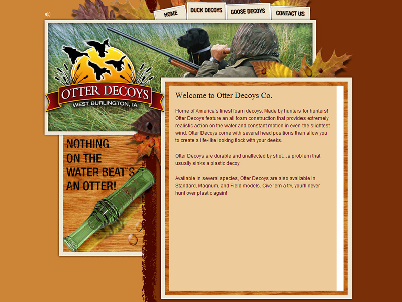
“Otter Decoys” is a company manufactures decoys for hunters.
The site is a catalogue for the products, they have made html tables to arrange the goods, photos of the products can be seen when you click on the links. This is a neat and simple way to organise information but it is very plain and ordinary.
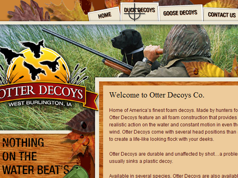
What makes the page interesting is the flash navigation bar that it a cross hair aiming at the links; users select the links by shooting at them. This really creates and connects to the products that they are selling. Since its main clientele are hunters this is some thing that I think they will find extremely fun and enjoyable to use.
The rest of the site uses html. It is quite ordinary but it provides essential information of their products (pricing and detailed images) and contact information. Users will find it easy and fast to get the information that they need.
There is an irritating fault in the design, an arrow that looks like a button was placed next to the links so users would think that is the button to the link but its not.
The overall colour scheme is a brownish colour; this suits the theme of the website and the products that they are selling.
In this site the flash made the page more interesting, but I feel that the designer could have tried to use more flash to make the presentation of the products more interesting. Overall the site is quite simple.