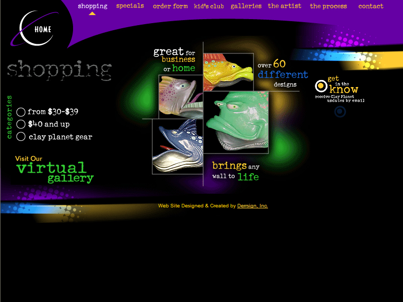
Clay Planet Designs this website provides promotes and sells clay figurines mainly of fish. A few features are gallaries of the artists works, check prices of items, find out information on ordering and purchasing the products .
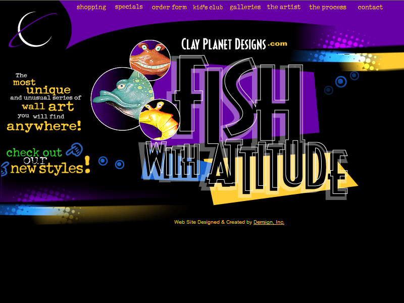
The main purpose of the site is to advertise their products, the index page is quite attractive with an interesting tag line and an animated display of their products, a simple bubble animation was used to enhance the “fishy” feel of the website.
The layout of the page is pretty traditional but the main page looks interesting because of the colours used, the bright neon colours attract the attention of both adults and children. The text used also creates a fun and casual feeling that suits the products
The shopping page has provided catagories for different the price ranges of their products, the have created a kind of radio button indication to show which catagorie the user is at it also in cludes a rollover. This provides good visual feed back for the user.
The site looks interesting and unique because of details like the rollovers and the interesting fonts the way pictures are laid out. The designer also tried to keep the lay out fairly constant which keeps people on track.
The many coloured fonts makes it difficult to tell which ones are links and which ones are words. The text has not been laid out properly, there are some sections where the text overshoots the borders and gives the page a sloppy look.