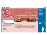
Selfridges & Co. is a chain of departmental stores in the UK. This flash site serves as a guide to all its stores in the UK.
The sites main colour is blue which is a colour that appeals to its wide range of users pages are colour.
The design and layout looks simple and very conventional but because of this users are able to access information more easily. This layout is consistent through out the site and makes it systematic for users to view, the users will always know where to find the information, the links or the navigation bar. As this site is like a guide it should allow people to find information in the shortest possible time and a consistent and familiar layout helps to do that.
The site contains a lot of information but the layout of information is well structured and finding specific sections is easy.
The page does not contain much dynamic flash animation but it uses flash very practically to provide simple rollovers that provide extra information or visual feedback. The rollovers provide short summaries of the content within the link. This allows people to be more aware of where they are going.
Navigating through the site is easy as under the different headings in the navigation there are sub headings which take you directly to the place you want.
The site loads quickly but they also provide a text version of the site.
Overall I think this site serves its purpose it's easy for users to get information. I think for a site like this content is very important, I feel this site provides relevant information that is structured in an interesting way.


